18CSE301J-Information Visualization
Kevin Thomas Koshy
RA2011003010018
Assignment 1
All India CPI Dataset Introductory Report
Assignment 2
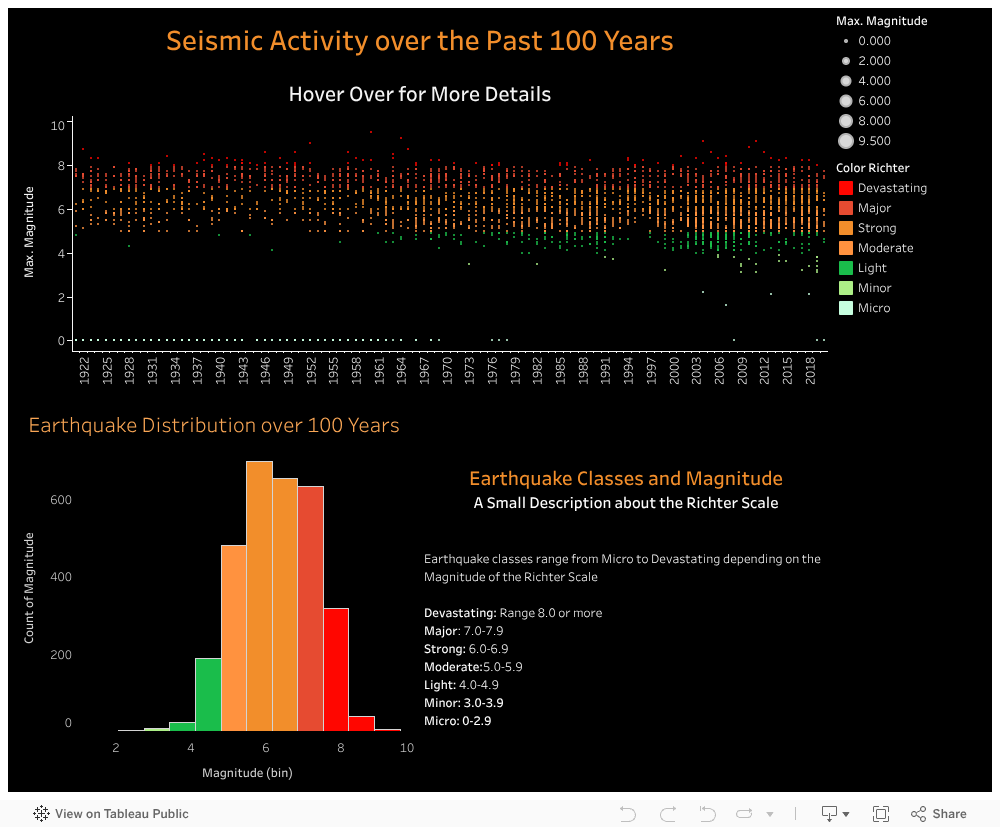
Earthquake Tableau Dashboard
Visualizing earthquake datasets can be extremely beneficial for understanding the distribution and frequency of earthquake activity. By mapping out earthquake data, it is possible to identify areas that are more prone to earthquakes and where resources should be allocated to improve earthquake preparedness. Visualization can also help us understand the distribution of earthquake magnitudes, which can be used to design buildings and infrastructure to withstand higher magnitudes in high-risk areas. Additionally, visualization can help identify patterns and trends in earthquake data over time, which can help us understand how earthquake activity is changing and whether there are any potential correlations with other factors.
Assignment 3
D3 Graph (Kerala General Index in 2011)
Visualizing Consumer Price Index (CPI) data of a state over the course of a particular period of time can provide valuable insights into how inflation is affecting that state's economy. By mapping out CPI trends over time, it is possible to identify periods of high or low inflation and compare inflation rates to the national average.
Assignment 4
Plotly Python
Visualizing Consumer Price Index (CPI) data at the state level can provide additional insights into how inflation is affecting different regions of the country. By mapping out CPI trends per state, it is possible to identify which states are experiencing higher or lower inflation rates and compare inflation rates across different regions.
CPI Change Comparison
Visualizing stock prices can be a powerful tool for investors and businesses looking to make informed decisions about stock market investments. By mapping out stock prices over time, it is possible to identify trends and patterns in the stock market and make more informed decisions about buying or selling stocks.